
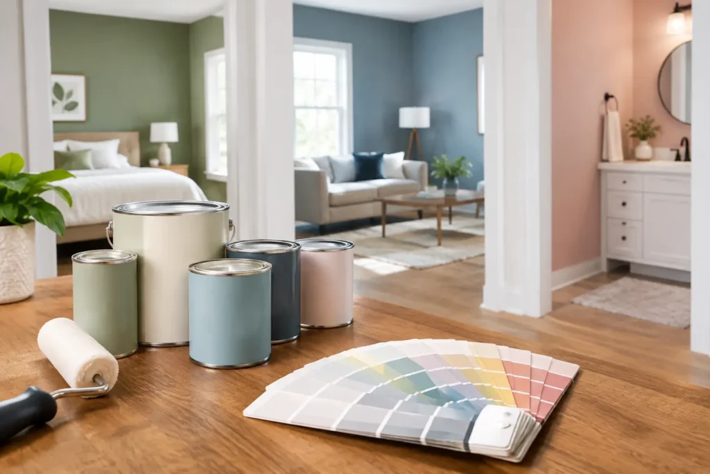
A paint color that looked perfect on a two-inch swatch can feel completely different once it covers four walls beside your flooring, cabinets, trim, and daylight. That is why learning how to select interior paint is less about picking a favorite color and more about choosing a finish that suits the way your home is used. The right paint should look good on day one, hold up to everyday life, and support the details that make a room feel complete.
For Long Island homeowners, paint choices often come up in the middle of a larger project – a kitchen refresh, a bathroom renovation, new floors, custom built-ins, or updated trim. Making the decision with the full room in mind saves time, avoids costly do-overs, and gives the finished work a more polished look.
Start With the Room’s Job
Before looking at color cards, consider what happens in the room. A quiet guest bedroom and a busy kitchen need different things from their paint. Foot traffic, moisture, cooking residue, pets, children, and direct sunlight all affect which product and finish will perform best.
High-use rooms usually benefit from a durable, washable paint. Kitchens, hallways, mudrooms, stairways, and family rooms tend to collect fingerprints, scuffs, and occasional splashes. A quality interior paint with good scrub resistance makes cleaning easier without leaving a dull spot behind.
Bathrooms need paint that can handle humidity. Even a well-ventilated bathroom experiences regular moisture, so choose a coating made for humid spaces and make sure the exhaust fan is doing its job. Paint can resist moisture, but it cannot solve an underlying ventilation issue.
For bedrooms, dining rooms, and formal living areas, you have more flexibility. Durability still matters, especially in a family home, but you may prioritize the softness of the finish or the way a color changes in natural light.
Choose the Right Sheen Before the Color
Sheen describes how much light a painted surface reflects. It affects the appearance of the color, how easily the wall cleans up, and how visible surface imperfections become. This is one of the most practical decisions in how to select interior paint.
Flat and matte paints have little to no shine. They create a calm, rich appearance and do a good job hiding minor drywall variations. They are often a strong choice for ceilings and low-traffic bedrooms. The trade-off is that some flat paints are less forgiving when scrubbed, although premium washable matte options have improved considerably.
Eggshell has a subtle soft glow and is a reliable choice for many walls throughout the home. It offers more cleanability than flat paint without looking noticeably shiny. Satin has a bit more sheen and added durability, making it useful for hallways, children’s rooms, kitchens, and bathrooms. Because it reflects more light, however, it can reveal patching, uneven drywall, or poor surface preparation.
Semi-gloss is commonly used on trim, doors, baseboards, and window casings. It stands up well to cleaning and gives millwork a crisp, defined finish. In a traditional home, a soft satin finish on trim can feel less glossy and more understated. The best choice depends on the style of the house, the condition of the existing woodwork, and the look you want to achieve.
Gloss levels should work together. For example, matte walls paired with satin or semi-gloss trim give a room clear definition. Using the same sheen on every surface can make a finished room feel flat, while too much shine may highlight every flaw.
Look at Fixed Elements First
Paint is one of the most flexible design choices in a room. Floors, countertops, tile, cabinetry, stone fireplaces, and upholstered furniture are much harder and more expensive to replace. Start there.
Bring paint samples near those fixed elements and look for the undertones. A gray floor may lean blue, green, or warm brown. White cabinetry may be bright white, creamy, or slightly gray. What appears to be a simple beige wall color can turn pink, yellow, or muddy next to the wrong material.
This is especially important during kitchen and bathroom work. A wall color should support the cabinets, backsplash, counter, and hardware rather than compete with them. If the tile or countertop has strong movement, a quieter paint color often gives the room balance. If the finishes are neutral and simple, the wall color can carry more personality.
Test Paint Where You Will Actually See It
Never make a final choice under store lighting alone. Buy sample pots and test a few likely colors on poster board, sample boards, or sections of the actual wall. Larger samples make it easier to see whether the color feels right at room scale.
Move the samples around the room and view them in the morning, afternoon, and evening. North-facing rooms can make colors appear cooler and flatter. South-facing rooms receive warmer, stronger light. A shade that feels fresh in a sunny kitchen may look dull in a darker hallway.
Also test the paint beside trim, flooring, and major furniture. If you are selecting white paint, this step matters even more. White is never just white. Some whites are crisp and cool, others are warm and creamy, and the wrong one can make a ceiling, cabinet, or existing trim look unexpectedly yellow or gray.
When comparing samples, give yourself a little time. A color that makes an immediate statement is not always the color you will enjoy every day. The goal is a room that feels right when you walk in, not one that only looks good in a photo.
Do Not Treat Prep as an Afterthought
Even the best paint will not look its best over cracks, dents, peeling layers, greasy walls, or rough repairs. Professional-looking results come from preparation as much as the final coat.
Walls should be cleaned, patched, sanded where needed, and primed in the right situations. Primer is particularly helpful over repairs, dark colors, water stains, bare drywall, and major color changes. It creates a consistent surface so the finish coat covers evenly and holds up better.
Trim and doors need their own attention. Old paint buildup, loose caulk, nail holes, and worn edges can make freshly painted millwork look unfinished. Careful sanding, filling, caulking, and masking are the details that give new paint the sharp lines homeowners expect.
If you are repainting after water damage, first confirm that the source of the moisture has been fixed. Covering a stain without addressing a roof leak, plumbing issue, or ventilation problem only delays a larger repair.
Match Paint Quality to the Project
Budget matters, but the least expensive gallon is not always the best value. Higher-quality paint often provides better coverage, stronger adhesion, richer color, and improved washability. It may cost more upfront but can reduce the number of coats and extend the time before repainting is needed.
That does not mean every room needs the most expensive product available. A rarely used guest room may not need the same level of durability as a kitchen used by an active family every day. Spend where the surface gets the most wear: busy walls, bathroom ceilings, trim, doors, and areas around sinks or entryways.
Pay attention to low- and zero-VOC options as well, particularly when painting bedrooms, nurseries, or occupied homes. Low-VOC paint can help reduce odors, but proper ventilation is still a smart part of the process.
Think Beyond a Single Room
A home does not need to use one color everywhere, but the rooms should feel connected. A simple way to create flow is to choose a small palette of related neutrals and accent colors. Repeating a trim color throughout the house can also create consistency, especially when rooms have different wall colors.
Transitions deserve attention. Stand in the hallway or open doorway and look at the rooms together. Two colors that look great independently can feel jarring when they meet. This is where thoughtful planning makes a renovation feel intentional rather than pieced together.
For open-concept spaces, use paint to define areas without chopping them up. One main wall color with a distinct dining-room accent or a deeper shade behind custom shelving can add character while keeping the layout cohesive.
When Professional Guidance Makes Sense
A straightforward bedroom repaint may be a manageable weekend project. But when a project involves high ceilings, extensive trim, wallpaper removal, damaged walls, new construction, built-ins, or a full renovation, professional preparation and application can protect the investment you are making in the space.
That Guy Carpentry helps homeowners coordinate paint choices with the larger details of a project, from new flooring and finish carpentry to kitchen and bathroom renovations. A well-planned paint job is not just a change of color. It is the finish that brings the room, and the work behind it, together.
Before committing, live with your samples for a few days and judge them in the light you actually use. The best interior paint choice is the one that fits your room’s conditions, supports your home’s character, and still feels like the right color after the furniture is back in place.